Among the many reasons this will never happen: the italics in real typefaces are extremely intricately designed around their specific angle. Which is among the many reasons that type specimen looks awful.
Yes, italic fonts are not just slanted versions of the typeface. However, more simply slanted text doesn't necessarily look bad and has its uses. I prefer slanted Roman for long blocks of special text as I find it more readable.
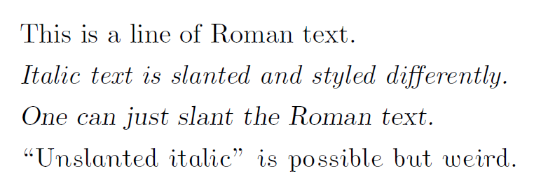
Here is a sample illustrating Computer Modern’s Roman, italic, slanted, and “unslanted italic” fonts:
It’s sub-pixel rendered for standard LCD displays (having noticed the sibling comment about that). Change .png to .pdf if you would rather have the document from which it was rendered.