With the general level of discourse on the internet, it's hard to be sarcastic and not be taken as a troll. There are subtle intonation cues when speaking face-to-face that can't really be translated well to text. So I would say that the sarcasm is ruined if it is too clearly marked, but it helps if it is marked in some way.
The problem is that sarcasm or ironic speech is meant to subvert the listener's expectations. You say something, people initially hear it straight, but then realize it's ridiculous and you're not being serious, and they find the juxtaposition amusing.
If you demarcate such language beforehand with backtalics or <sarcasm> tags, then there is no such juxtaposition and thus no realization.
Plus, while difficult, there are ways to hint an intonation in text.
Most people use their tone of voice to indicate sarcasm. When someone uses a sarcastic tone of voice, I submit that we don't initially hear it straight, back up and rethink it.
Your thinking only applies to a true deadpan comment with a straight tone of voice - that's not the majority of sarcastic comments we hear.
You don't think Shakespeare and Wilde had to work pretty hard to get their wit onto the page? The average weblog commenter who tries is rather less successful.
This is clearly false, as both irony and sarcasm are usually delimited by both changes in speech and nonverbal cues. The better you know each other, the fewer of such cues are necessary, but especially among 'new' people, you'd better make sure they get you are being sarcastic/ironic, lest they get a completely wrong impression of you. The lack of cues and subsequent misunderstandings is exactly the problem with speech on the internet and is exactly why things like italics exist: to be able to shift emphasis like you'd do with speech or nonverbal cues.
"reverse italics (‘linkskursiv’ = ‘left cursive’ or ‘rückwärts liegend’ = ‘lying backwards’) are often used in cartography, traditionally to indicate waters"
Among the many reasons this will never happen: the italics in real typefaces are extremely intricately designed around their specific angle. Which is among the many reasons that type specimen looks awful.
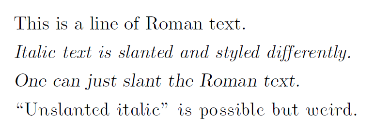
Yes, italic fonts are not just slanted versions of the typeface. However, more simply slanted text doesn't necessarily look bad and has its uses. I prefer slanted Roman for long blocks of special text as I find it more readable.
Here is a sample illustrating Computer Modern’s Roman, italic, slanted, and “unslanted italic” fonts:
It’s sub-pixel rendered for standard LCD displays (having noticed the sibling comment about that). Change .png to .pdf if you would rather have the document from which it was rendered.
Sarcasm shouldn't stick out at first, because half the reason for sarcasm's being enjoyable is the feeling when you "get it" without any help. I was playing around with making <sarcasm> render normally, but with a little grey square at the end of a sarcasm block, inline with the rest of the text, which, when you hover over it, higlights the text pink if it actually was sarcasm. There would also be <seriously>, which would have the same grey square, but wouldn't light up. in order for sarcasm to still get laughs/amused grins, <sarcasm> and <seriously> would have to be used in roughly equal amounts, so you'd never be able to accidentally scan ahead to realize which one you have.
But it does tend to stick out, when spoken (not in print). When people say something sarcastically, they don't say it deadpan and straight. There is usually at least some difference in their tone of voice, though its not necessarily an over-exaggerated sarcastic teenage drawl.
I think someone above more correctly identified this as a deadpan delivery of some sarcastic statement. This is probably more effective and funny. But sometimes people like to be very blatant about the fact that they're being sarcastic. Especially when talking with someone they don't know well. Like strangers on the internet.
I think that no one wants to highlight sarcasm. People love to be sarcastic when other people don't get it. It makes them feel superior.
When someone is concerned on the reception of a particular sentence, he uses emoticons that already serve this purpose. If someone does not highlight sarcasm, I think he does this on purpose.
Not long ago, someone introduced a new character for sarcasm, the SarcMark: www.sarcmark.com